What a SaaS landing page needs, and how to build one in Framer
NS. Studio · 2026-10-06
A SaaS landing page has to explain a product nobody has used yet, prove that it works and get a sign-up, all before the visitor gets bored. Here are the sections that do that work, in the order visitors expect them.
1. A hero that shows the product
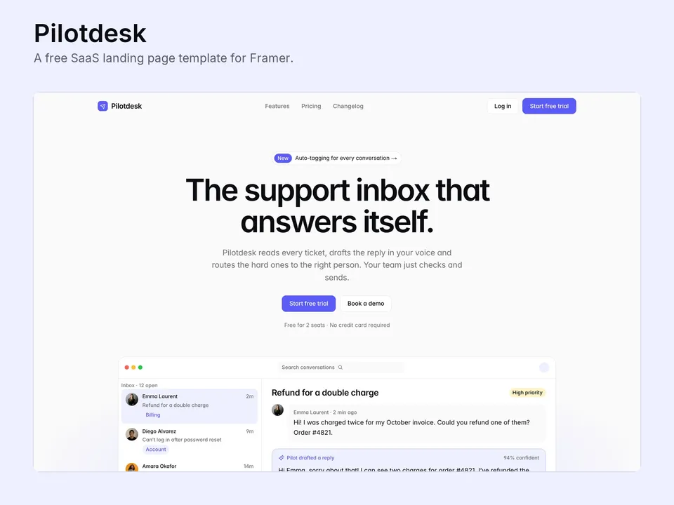
One sentence about the outcome, one line on how, a primary call to action and a real-looking product shot. Screenshots go out of date fast. A product shot built from editable layers can be updated in minutes when the UI changes.
2. Features framed as jobs done
"Auto-tagging" is a feature. "Every ticket is tagged before anyone opens it" is a reason to buy. Six short feature cards with an icon each are enough.
3. Proof
A logo row, two or three testimonials with names and roles, and a stats band if you have real numbers. Never invent numbers.
4. How it works
Three steps from sign-up to value. This answers "is it hard to set up?" before anyone asks.
5. Pricing with a comparison table
Show plans with one highlighted tier, then a full comparison table and a billing FAQ underneath. People who scroll that far are close to buying, so answer the last questions there.
6. A changelog
A public changelog shows the product is alive. Run it from the CMS so publishing an update takes a minute.
Templates that already include this
- Pilotdesk (free): a hero with a product shot built from Framer layers, features, a stats band, three steps, testimonials, an FAQ, a pricing page with a comparison table, and a CMS changelog.
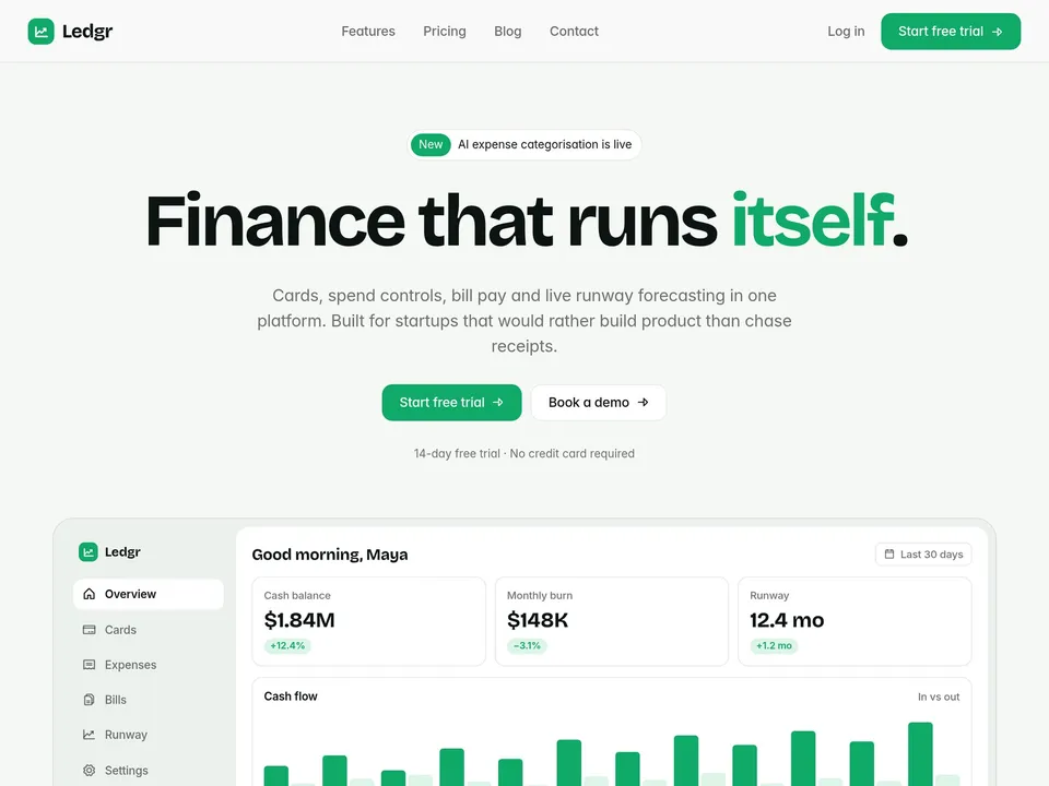
- Ledgr: a multi-page SaaS and fintech site with Features, Pricing with a comparison table, a CMS blog and a contact form.
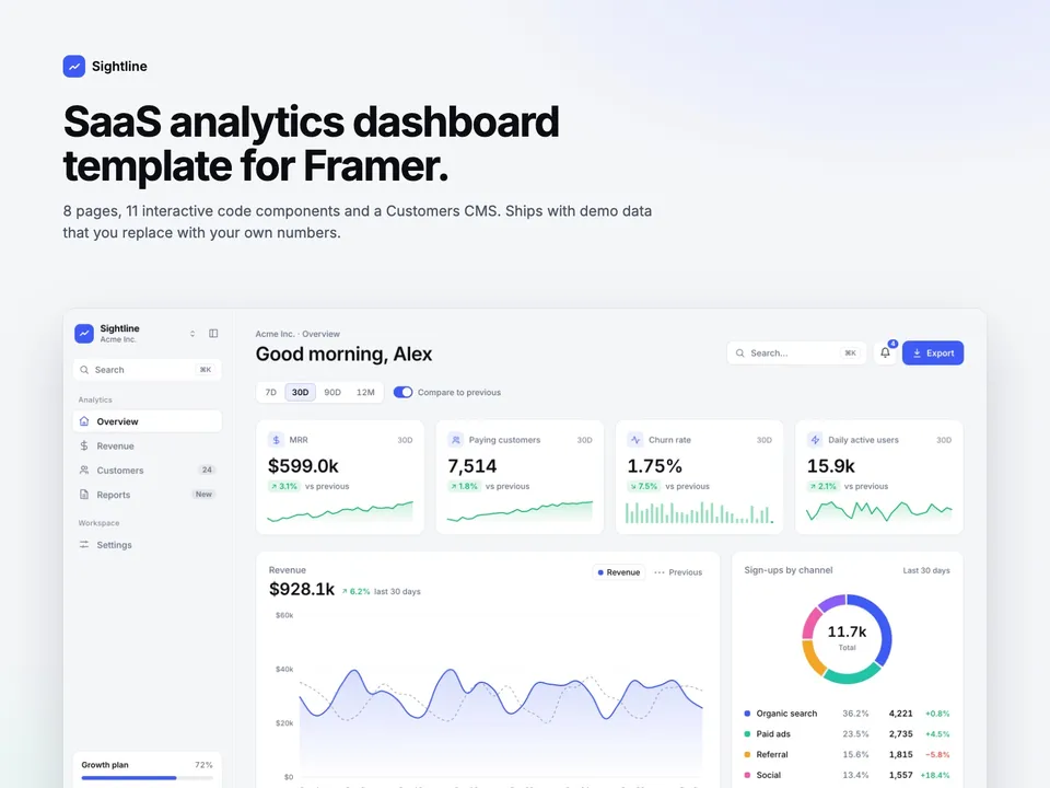
- Sightline: if your product is a dashboard, this is an 8-page analytics UI with 11 interactive components to demo it.